Welcome to this easy guide by Neeraj Aneja, designed to help you choose the best chart type for your data. Whether you’re looking to show trends, compare categories, or highlight parts of a whole, understanding when to use each chart can make your insights clearer and more impactful. For more tips and resources, visit neerajaneja.com and start visualizing your data like a pro!
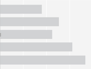
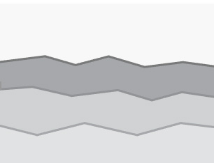
Stacked Bar Chart
A Stacked Bar Chart displays total values across categories, with each bar divided into segments showing sub-category contributions.
– Comparing totals and subgroup breakdowns.
– Visualizing data composition over time or categories.
Stacked Column Chart
A Stacked Column Chart is similar to a stacked bar chart, but uses vertical columns instead of horizontal bars.
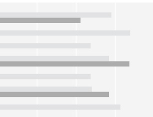
Clustered Bar Chart
A Clustered Bar Chart (also called a grouped bar chart) displays bars grouped side by side for each category, representing different sub-categories. Use it when: – You want to compare multiple sub-categories across categories. – Clear comparison of values within and across groups is needed.
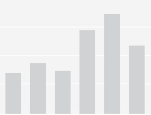
Clustered Column Chart
A Clustered Column Chart is a vertical version of a clustered bar chart. It groups vertical columns side by side for each category, with each column representing a different sub-category.
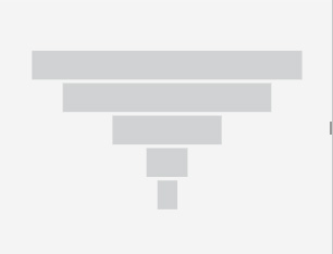
100% Stacked Bar Chart
A 100% Stacked Bar Chart shows the relative percentage of sub-categories within each bar, with all bars having the same length (100%). Use it when: – You want to compare percentage contributions of sub-categories across categories. – The total value is not important, but proportions are.
100% Stacked Column Chart
It’s just like a 100% Stacked Bar Chart, but with vertical columns instead of horizontal bars.
Line Chart
A Line Chart displays information as a series of data points connected by straight lines.
Use it when: – You want to show trends over time (days, months, years, etc.). – You need to track changes or progress continuously. – Comparing multiple data series (e.g., sales of different products over months).
Area Chart
An Area Chart is like a line chart, but the area below the line is filled with color to emphasize volume. Use it when – You want to show trends over time and highlight the magnitude of change. – You need to visualize cumulative data or total values.
Stacked Area Chart
A Stacked Area Chart shows multiple data series stacked on top of each other, with the area under each line filled to show part-to-whole relationships over time.
100% Area Chart
A 100% Area Chart shows how different parts contribute to a total of 100% over time, with areas stacked to fill the entire chart height.
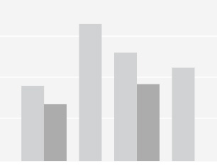
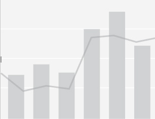
Line Stacked Column Chart
A Line Stacked Column Chart combines stacked columns and a line graph. The columns show parts of a whole for each category, and the line shows the overall trend or total. It’s great for seeing both detailed breakdowns and the big picture together, like sales by product and total sales over months.
Line Clustered Column Chart
A Line Clustered Column Chart combines clustered columns and a line graph. The clustered columns display multiple sub-categories side-by-side for each category, while the line shows a related trend or total.
Ribbon Chart
A Ribbon Chart is a type of chart that shows changes in rank or value over time between different categories using flowing, ribbon-like shapes. The ribbons twist and cross to highlight how categories move up or down in position.
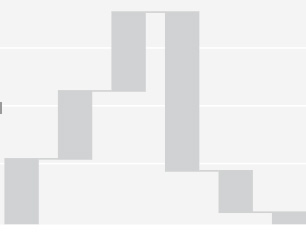
Waterfall Chart
Lorem ipsum dolor sit amet, consectetur adipiscing elit. Ut elit tellus, luctus nec ullamcorper mattis, pulvinar dapibus leo.
Waterfall Chart
A Waterfall Chart shows how an initial value is affected by a series of positive and negative changes, leading to a final result. It looks like a series of floating bars that “step” up or down.
Scattered Chart
A Scatter Chart (or scatter plot) displays points on a graph to show the relationship between two variables.Use it when You want to see if there’s a correlation or pattern between two data sets.
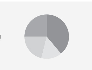
Pie Chart
A Pie Chart is a circular chart divided into slices to show the proportions of different parts within a whole.Use it when You want to display percentage or share of categoriesand Showing how a total breaks down into parts.
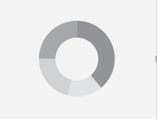
Donut Chart
A Donut Chart is like a pie chart but with a hole in the center, creating a “donut” shape.
Tree Map
A Tree Map is a chart that displays hierarchical data using nested rectangles. Each rectangle’s size represents a value, and the rectangles are grouped by categories.
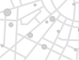
Map
A Map Chart displays data geographically on a map, using colors, markers, or shading to represent values in different regions.
Filled Map
A Filled Map Chart colors regions on a map based on data values, with different shades representing different levels.
Gauge
A Gauge Chart (or dial chart) looks like a speedometer and shows a single value within a range.Use it when you want to display progress, performance, or status against a target. Visualizing KPIs like speed, temperature, or sales vs. goal.
Card
A Card is a simple visual that displays a single key number or metric prominently, often with a label and sometimes an icon or small trend indicator.
Multi Row Card
A Multi-Row Card is like several card charts stacked or arranged in rows, each showing different key metrics or data points side by side or one below another.
KPI
A KPI Chart (Key Performance Indicator Chart) highlights important business metrics to quickly show how well you’re meeting goals.Use it when you want to track critical metrics like sales, revenue, or customer growth.
Slicer
A Slicer is a visual filter tool used in dashboards and reports to quickly filter data by selecting one or more values. Use it when you want users to interactively filter charts or tables.
Table
A Table organizes data in rows and columns for easy reading and comparison. Use it when you want to show detailed, precise data.
Matrix
A Matrix is like a table but allows you to group and summarize data by rows and columns, often with expandable/collapsible sections.
Useful when you want to show data grouped by multiple categories.
Key Influencers
A Key Influencers chart helps identify the factors that have the biggest impact on a specific outcome or metric. it is useful when you want to understand what drives a result (e.g., sales, customer satisfaction).
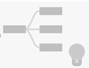
Decomposition Tree
A Decomposition Tree is a chart that breaks a big number into smaller parts so you can see what causes it.
Card
A Card is a simple visual that shows one key number or metric clearly. Use it when you want to highlight an important value quickly and showing things like total sales, number of users, or profits.
Slicer
A Slicer is a filter tool that lets you pick specific values to filter data in reports or dashboards easily.
I am Neeraj Aneja, a UX, UI, and Product Designer in Bangalore. I specialize in creating seamless, user-centric experiences for both B2B and B2C projects.